The Problem With Most Logos
Walk through any city, browse any industry directory, or scroll through LinkedIn for ten minutes — and you will see hundreds of logos that have nothing to say. They are geometrically tidy. They use the right number of colours. They are technically competent. And they communicate absolutely nothing distinctive about the business behind them.
This is the default state of most brand identities today. Not offensive. Not wrong. Just empty.
The reason is not a shortage of design talent. There is more design capability available today — at more price points — than at any point in history. The reason is that most logos are briefed and created without strategic intent. A business needs a logo, a designer is hired, options are presented, and the client chooses the one that feels most comfortable. The result is a mark built on preference rather than purpose.
What a Logo Is Actually For
A logo has one job: to make a business instantly recognisable and to signal something meaningful about what that business stands for. It is not decoration. It is not a reflection of the founder's aesthetic taste. It is a commercial tool.
The best logos in the world work because every element — the form, the typeface, the colour, the proportion — was chosen to communicate something specific to a specific audience. FedEx uses a hidden arrow to signal forward momentum and precision. Nike's swoosh communicates movement and aspiration in a single gesture. These are not accidents. They are the results of deliberate strategic thinking expressed through design.
Most logos fail this test because the thinking was never done. A designer who does not understand what a business is trying to communicate to whom, and what it needs to be believed about, cannot produce a logo that does meaningful work.
The Five Most Common Logo Failures
First: trend dependency. The logo was designed to look current rather than to last. Logos built on visual trends — particular illustration styles, gradient treatments, or geometric fashions — age visibly and quickly. A brand that refreshes its logo every four years because it looks dated is spending money on a problem it created.
Second: no differentiation. The logo looks like every other logo in its category. This is particularly common in professional services, technology, and food and beverage. A law firm that uses a serif wordmark in navy blue is communicating nothing that distinguishes it from the five other firms on the same page. If your logo could belong to your competitor, it is not working.
Third: poor scalability. The logo works on a business card but collapses at small sizes or on digital screens. Detail is lost. Colours shift. The mark becomes illegible. A properly designed logo system includes variants for different contexts — a primary mark, a simplified version, a monogram — all tested across real applications.
Fourth: no versatility. The logo only works on white. Put it on a dark background, a photographic image, embroidered on fabric, or etched on glass, and it fails. A complete logo system works across every surface it will ever touch.
Fifth: designed without a system. The logo exists, but nothing around it — colours, typography, spacing, voice — is codified. So every designer, vendor, and team member who uses it interprets it differently. Over time, the brand fractures.
How to Fix It
The starting point is not a redesign. It is a diagnosis. Before touching the visual, answer these questions honestly: What do you want people to believe about your business that they currently do not? Who specifically are you trying to attract, and what do they value? What visual territory does your category occupy, and how can you occupy something different? Where and how will this logo actually be used — in what formats, at what sizes, on what surfaces?
With clear answers, the design brief writes itself. The designer's job becomes translation: taking a well-defined strategic position and finding the visual form that expresses it precisely and lastingly.
A logo redesigned with this foundation does not need to be replaced in four years. It needs to be protected.
What a Working Logo System Looks Like
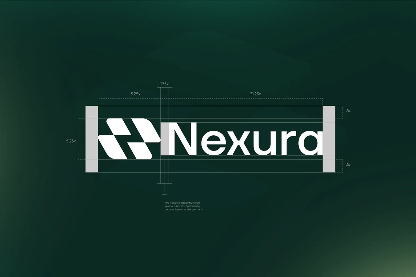
A complete, functioning logo system includes: a primary mark that works as the main identifier; secondary variants for constrained applications; a monogram or icon for small-scale use; colour versions in full colour, single colour black, single colour white, and reversed; clear rules for minimum size and clear space; and a file pack that covers every digital and print format.
When all of this is in place, your brand has a stable visual foundation that every team member, agency, and vendor can use consistently without your involvement in every decision.
The Return on Getting It Right
A logo that works is not an expense. It is infrastructure. Every touchpoint — your website, your packaging, your social media, your signage, your sales presentations — becomes more effective when the mark behind it is sharp, consistent, and deliberately positioned.
Businesses that invest in strategy-led brand identity consistently report stronger first impressions, higher perceived value, and greater recall among target audiences. The work pays for itself many times over — but only when it is done properly, with thinking preceding execution.